Lift Digital Solutions is a digital advertising arm that helps clients place messages across a wide spectrum of platforms, including apps, on the web and digital out of home.
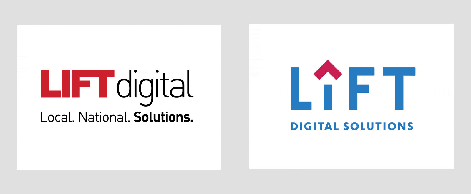
We’ve designed a set of new logos to usher in brighter, airier and more playful future that better reflects our diverse offerings and advanced capabilities.
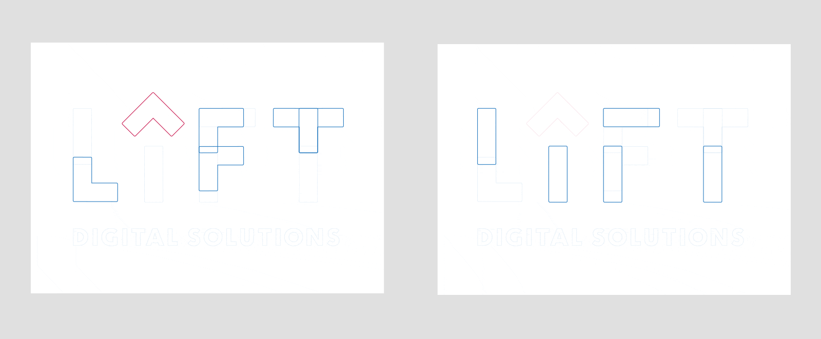
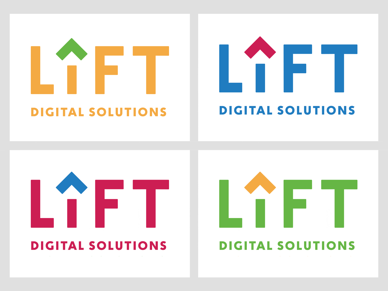
The idea plays on the idea of upward motion, with the i doubling as an arrow icon. Those two basic shapes were then used to create the rest of the primary letter forms.
Programmatic advertising isn’t boring; it can be fun and fast! As technology shifts, it creates new opportunities for creative messaging. We chose our color scheme from those that you might see on a hot air balloon, which encourages excitement.
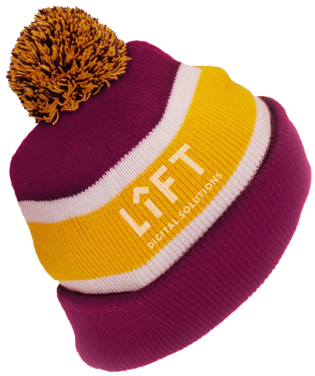
We’re even keen on these radical color schemes (every once in a while).
The main logo mark can still legible at smaller sizes.
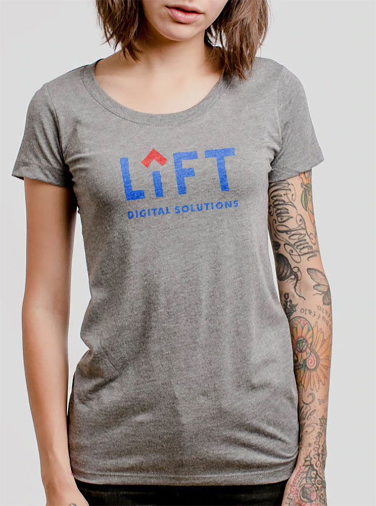
And it looks great on swag.